the New Corporation
The unfortunately necessary sequel
THE CORPORATION examined an institution within society. THE NEW CORPORATION reveals a society now fully remade in the corporation’s image, tracking devastating consequences and also inspiring movements for change. The New Corporation reveals how the corporate takeover of society is being justified by the sly rebranding of corporations as socially conscious entities. - from the film website
Opening Sequence
The film opens with a monologue about the Enlightenment. The filmmakers were looking for imagery to underscore the dystopian sense of the hollowing out of democracy.
Design Challenges
Like many other expository documentaries, this project’s design challenge was to show varied information consistently: headlines, graphs, infographics, lower thirds, chapter headings, and, in this case, a bespoke opening sequence as an overture for the film. The prequel had a strong and pretty cheeky identity; this film needed to evolve from there with gravitas, a sense of gritty reality, but not an excessively ominous look.
We went with an overall textural overlay using photography of concrete, applied liberally to chew up typography and blocks of colour. Palette is limited: greys, red, warm and cool tints for positive and negative content.Type is blocky, strong. Lower thirds have a gentle flourish with a repeating mnemonic of unfolding panels. Headlines are exaggeratedly large, to give the content an exclamatory, poster-like impact. Custom-built templates for entry and exit transitions ensure the headlines have variety, but feel of a piece with one another. Chapter headings for the earlier, more doom-filled material used darker greys and blues with vertical stripes from barcodes as a transitional device; this changed to brighter tones and vertical tree trunks in the more hopeful ending sequences. Touches like these go a long way to help a film feel cohesive, and to signal structural progression for the audience.
Infographics & Lower Thirds
These elements have a lot to do with building design cohesion across a whole feature film. Sharing texture, colour, typography, and patterns of motion brings a subconscious sense of consistency and confidence.
Checklist & Title
The checklist appears several times in the film. This instance sets up the title sequence.
Coal
One of many infographic sequences, featuring collage, heavy texture, and giant type. We lvoed this chunky font, URW Geometric.
Playbook to Katie Porter
The playbook element functioned as chapter headings. This one precedes an infographic on wage disparity, followed by Katie Porter’s whiteboard demolition of an interviewee.
Headlines
Always a tough one: licensing requirements often disallow aestheticization of news headlines—it’s thought to undercut the veracity of the material—but the look of them is so tied to the individual journal, paper, or online source. Visually, they can take you out of the film. Here we had some flexibility to superimpose text on video, and to use the film’s type look instead of the source’s. The source logo and article date helped with authenticity.
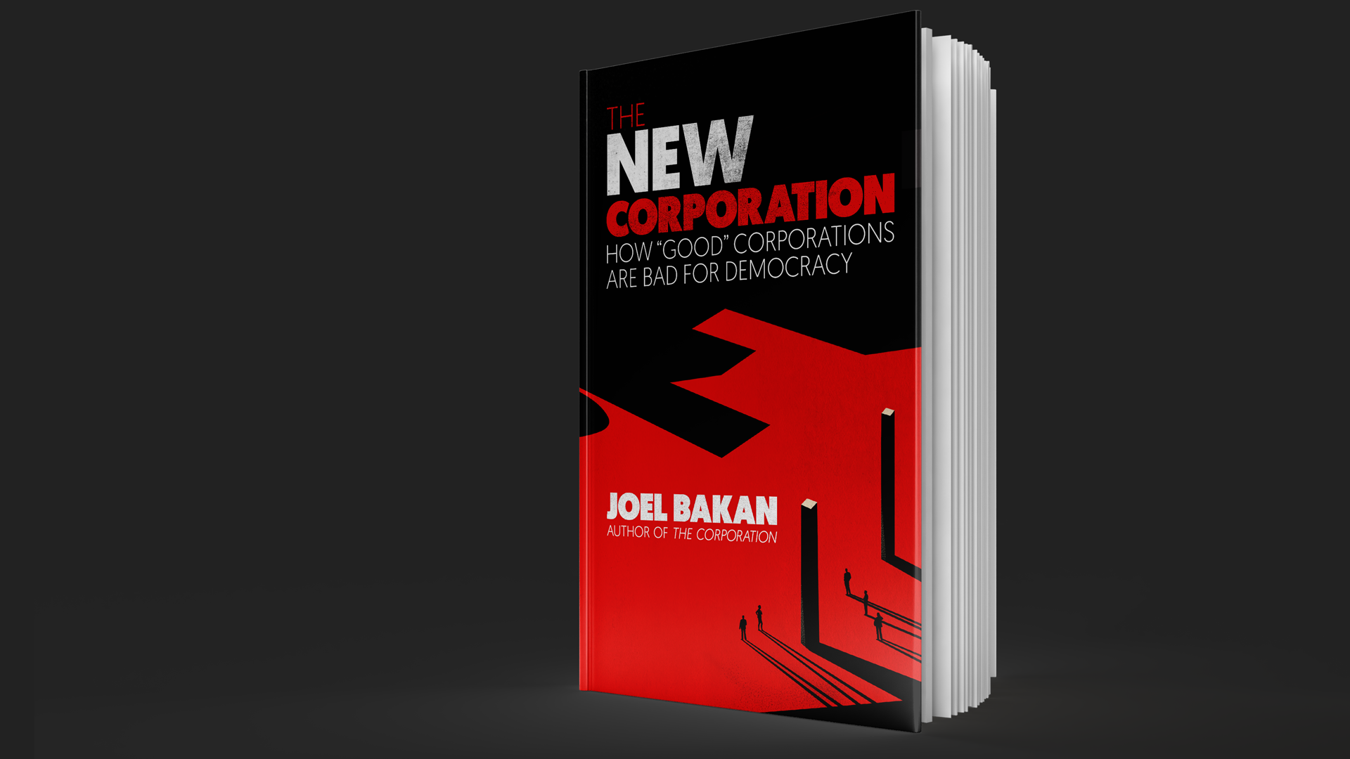
Additional Design
Both documentaries are based on writing by internationally renowned law scholar Joel Bakan. Designing the book cover was a fun side-project, and a nice way to connect the identity of the book and film. Noam Chomsky calls the New Corporation A very important book, an arresting study directed to a central issue of the times.